Fork & Good
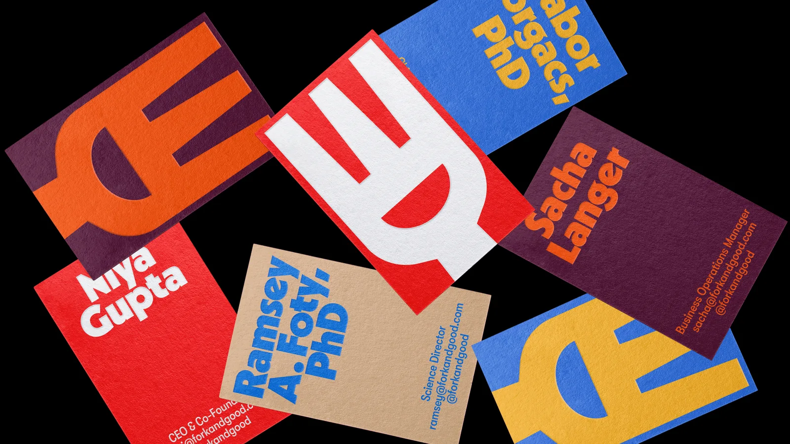
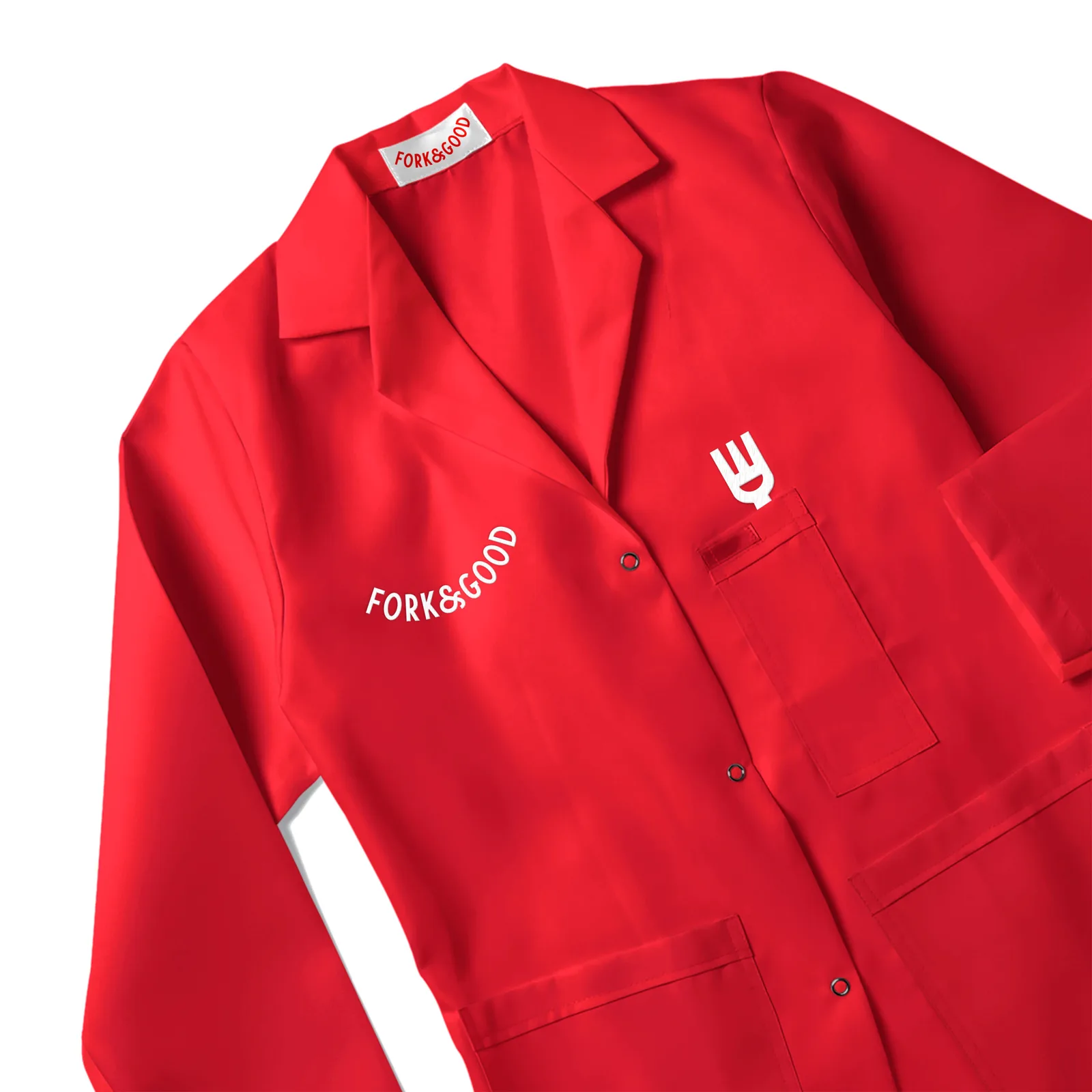
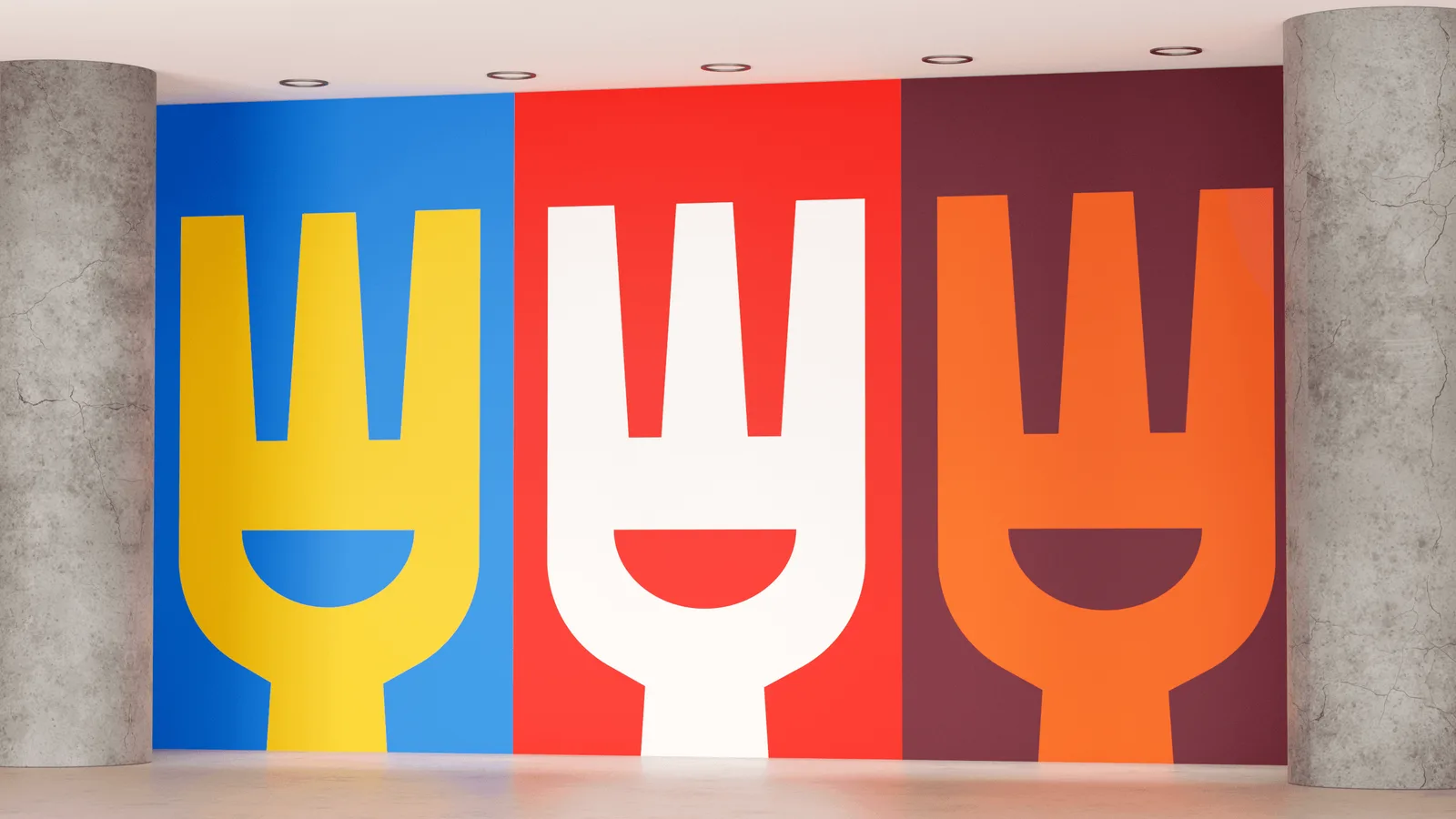
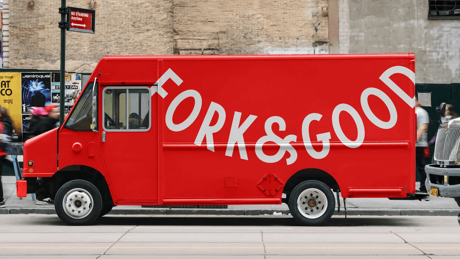
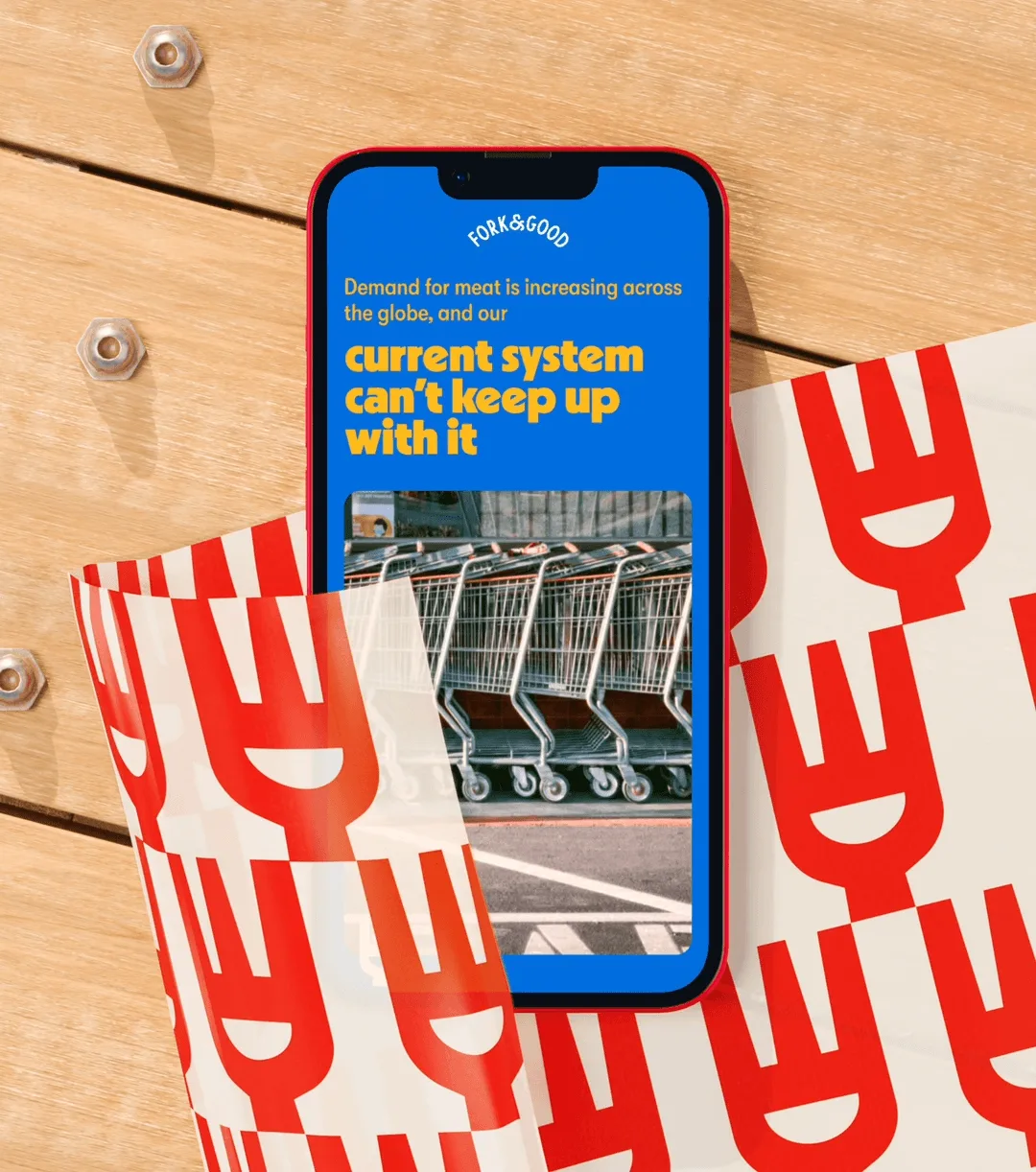
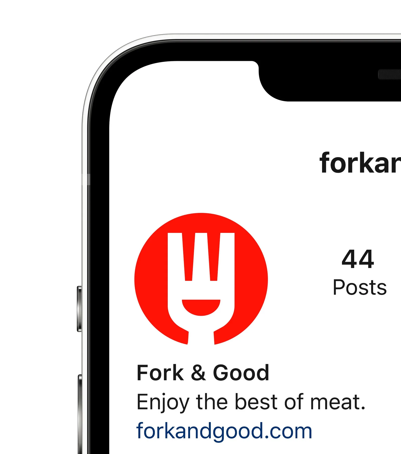
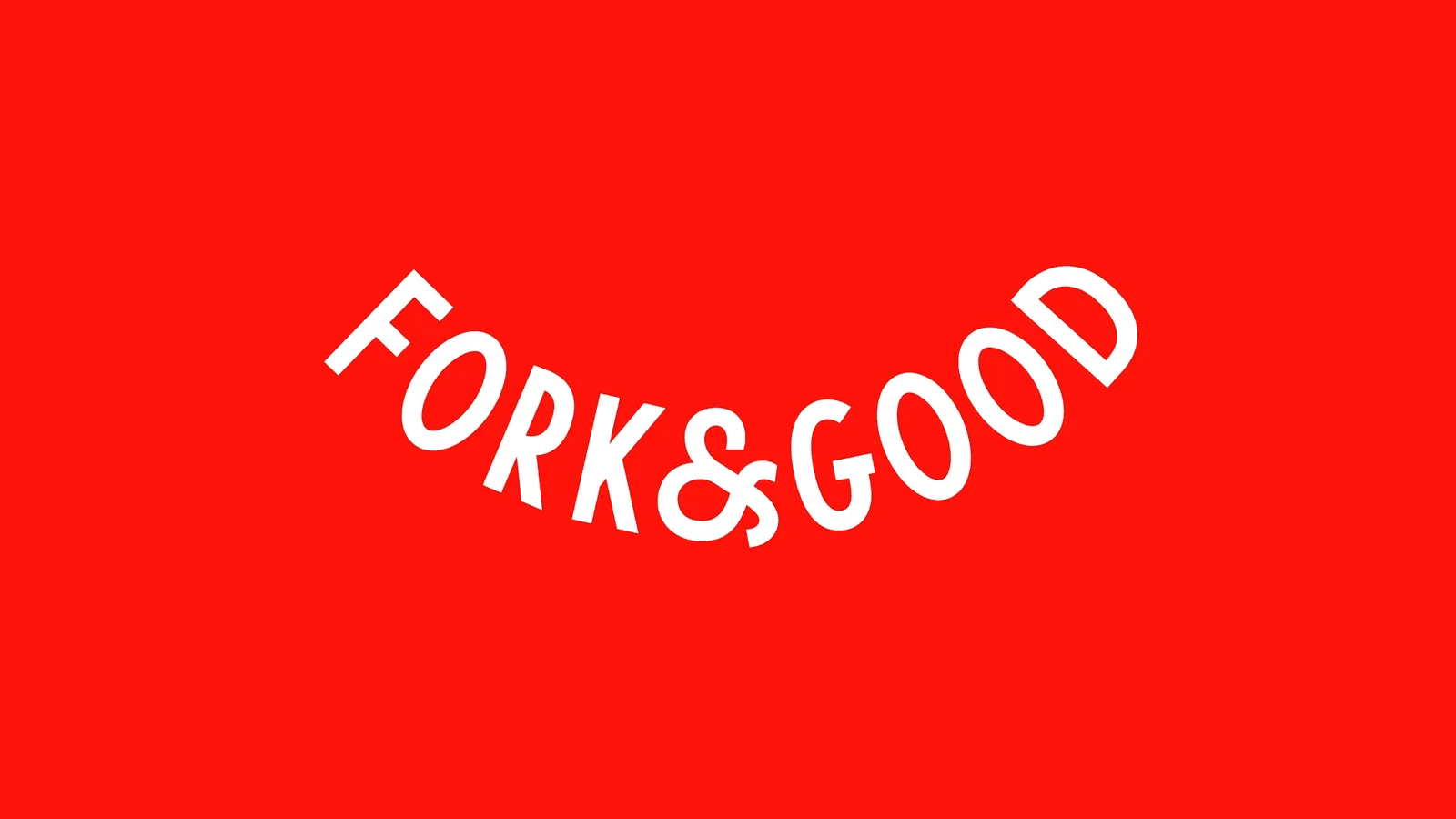
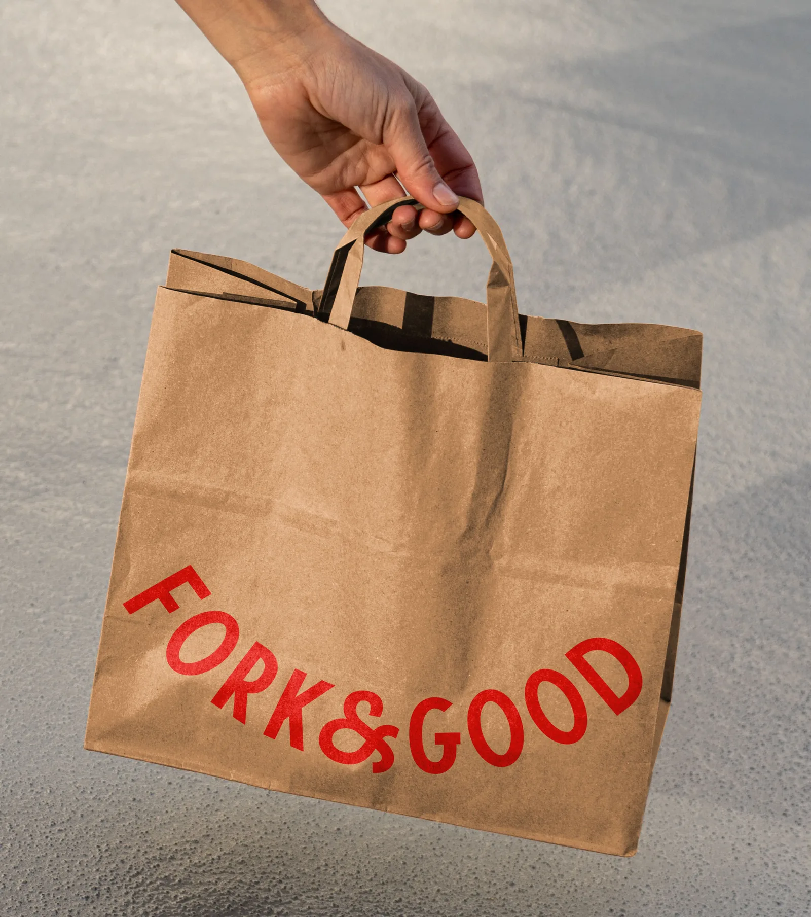
"To craft their wordmark, we studied brands with mass appeal and found inspiration in traditional butcher shop signage. The curvature of the mark emulates the characteristic cutout in our new “Smiley Fork” logo, and both curve and cutout “smile” express living, dynamic variations in both motion and static use cases. What’s more, the same cutout informs the “bowl” device in our graphic system—the two-dimensional container for scrumptious meal variations photographed in high contrast—and, paired with chopsticks found in the negative space between the fork’s tines, further represents the universality inherent to the brand’s DNA. The system is rounded out by repetitive, food-wrapper-like patterns and a vibrant color palette of bright red, cool dijon, deep eggplant, and other delicious tones that are appetizing and timeless."
Looking to build an iconic brand identity or packaging?
We partner with ambitious founders, startups, and luxury brands to design distinctive visual identities, bespoke typography, packaging systems, and comprehensive design languages.
Explore Newest & Featured Projects
 2026 · Branding
Bar Rêve
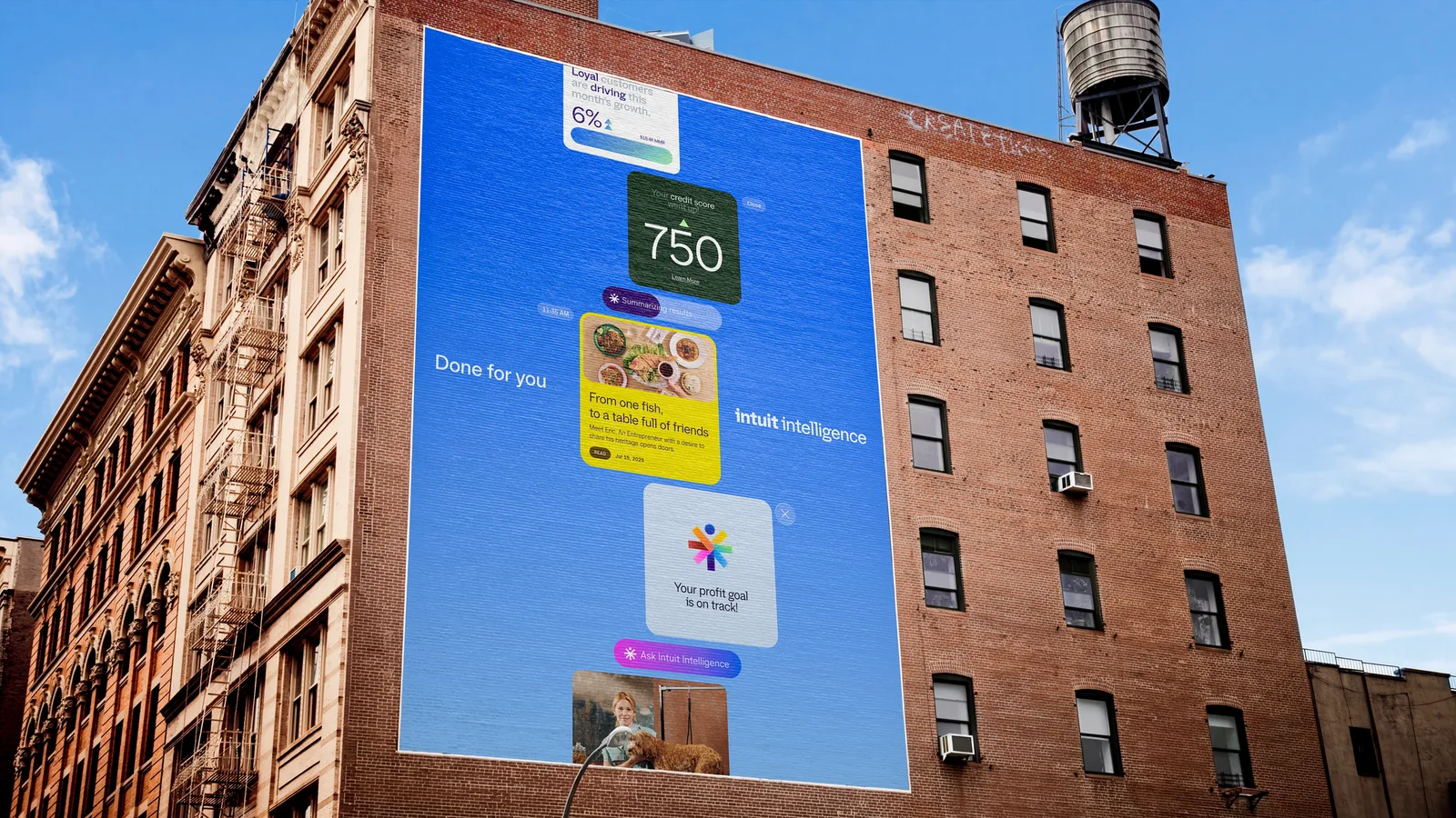 2026 · Branding
Intuit
 2026 · Branding
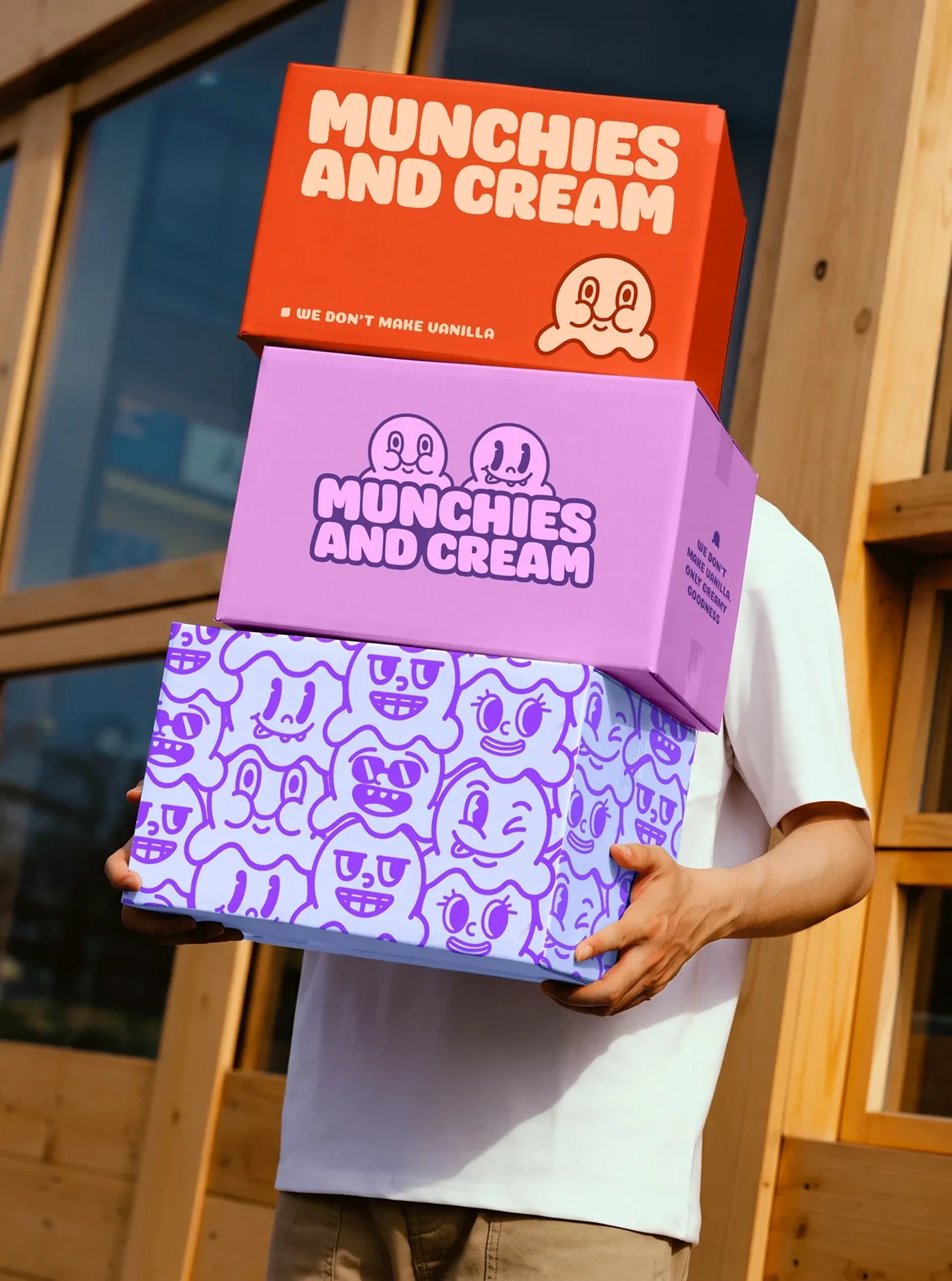
Munchies and Cream
 2026 · Branding
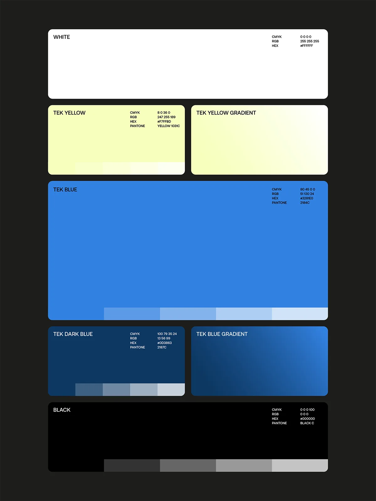
Tekprivacy
 2026 · Packaging
Argintum, a Premium Spirit Design where Argentine Mate meets English Gin
 2026 · Packaging
Chrysi represents Extra Fresh Eggs in new Avgoulakia series
 2026 · Packaging
The Tarot Triad: Star, Sun and Moon on Dolcedolka Orange Slices in Chocolate
 2026 · Packaging