Rerun
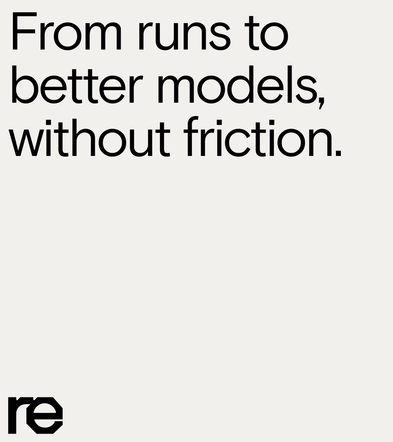
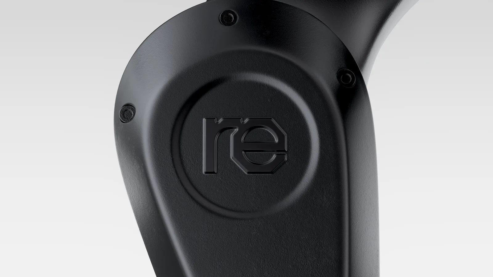
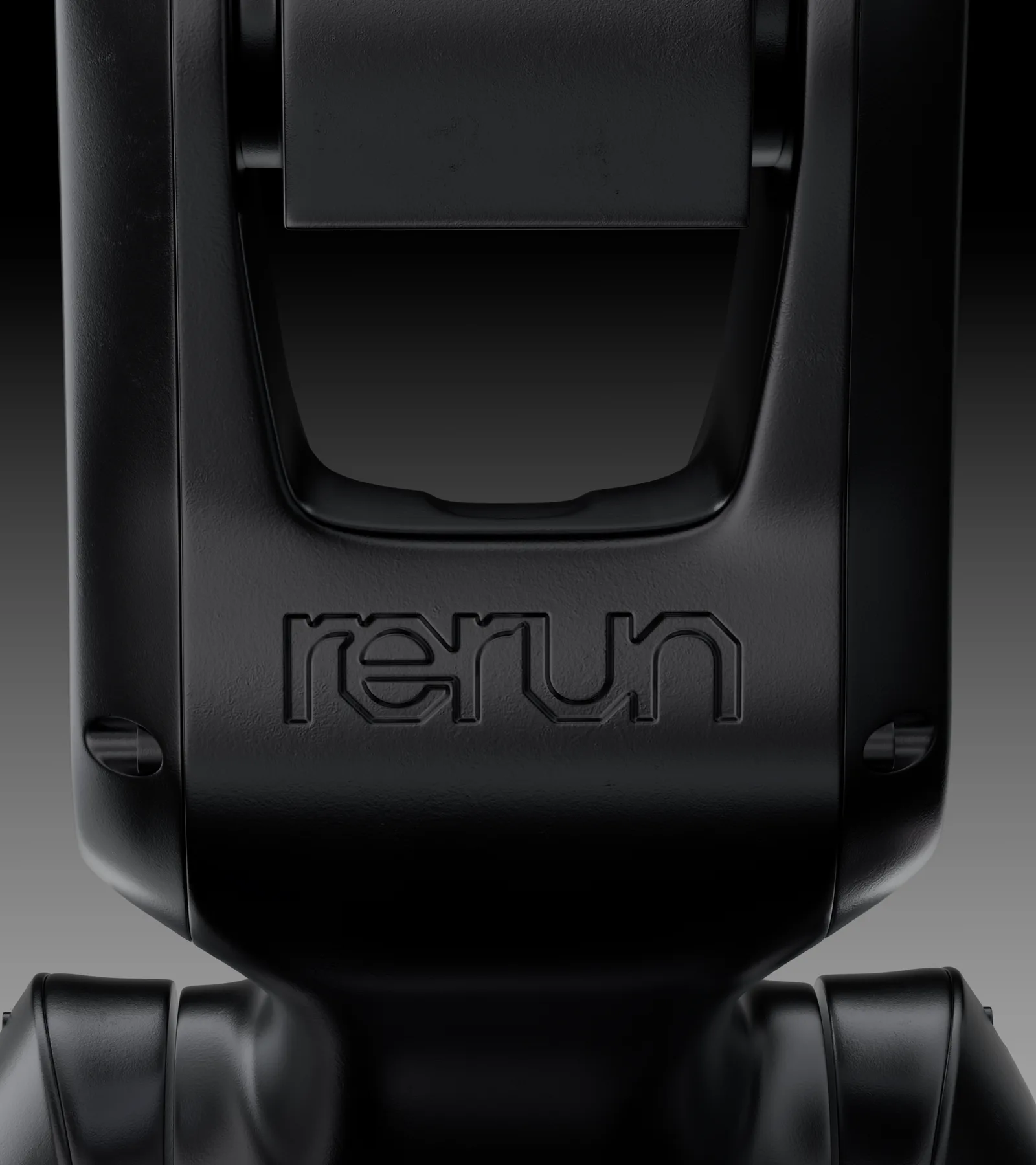
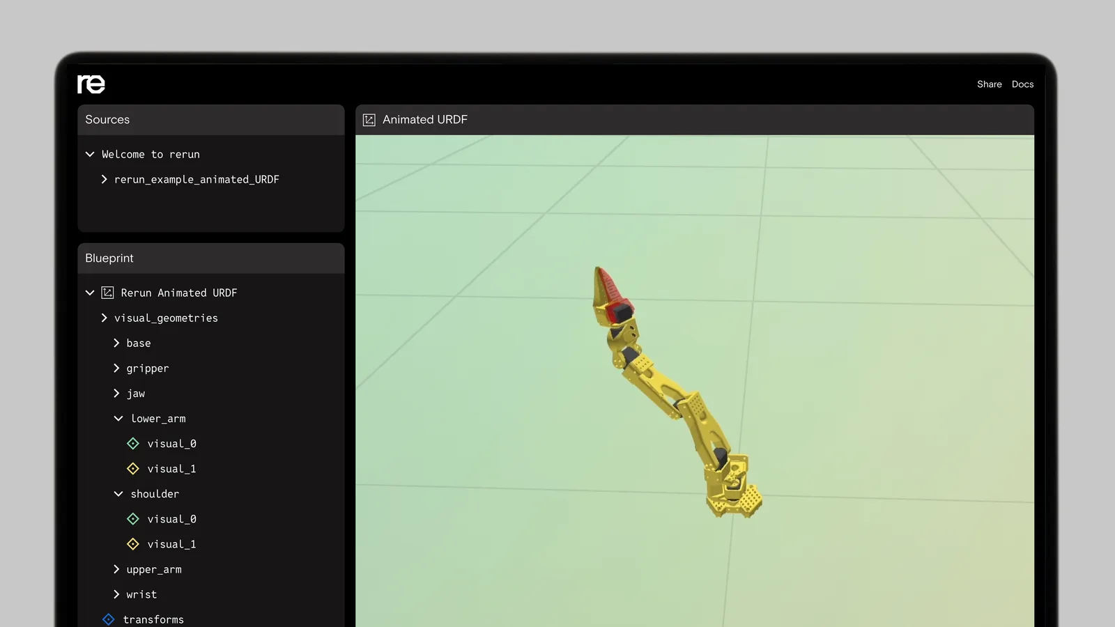
Rerun makes open source software that lets robotics teams see what their robots see, then log, search and train on that data. Studio Gruhl gave it a brand built on one question: how do robots see? Instead of the clean, clinical look most robotics companies reach for, the identity goes to the workshop, with bolts, soldering irons and melted chips, and treats the people who build robots as makers like any other.
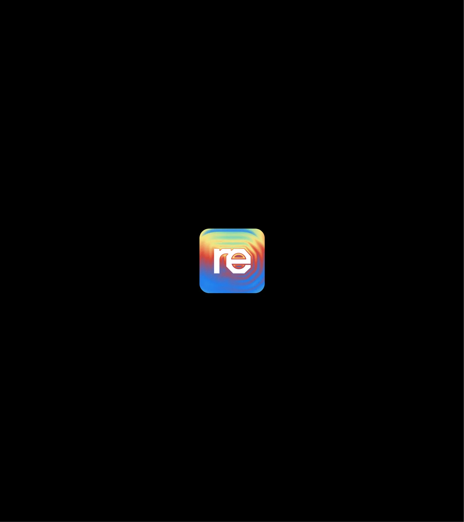
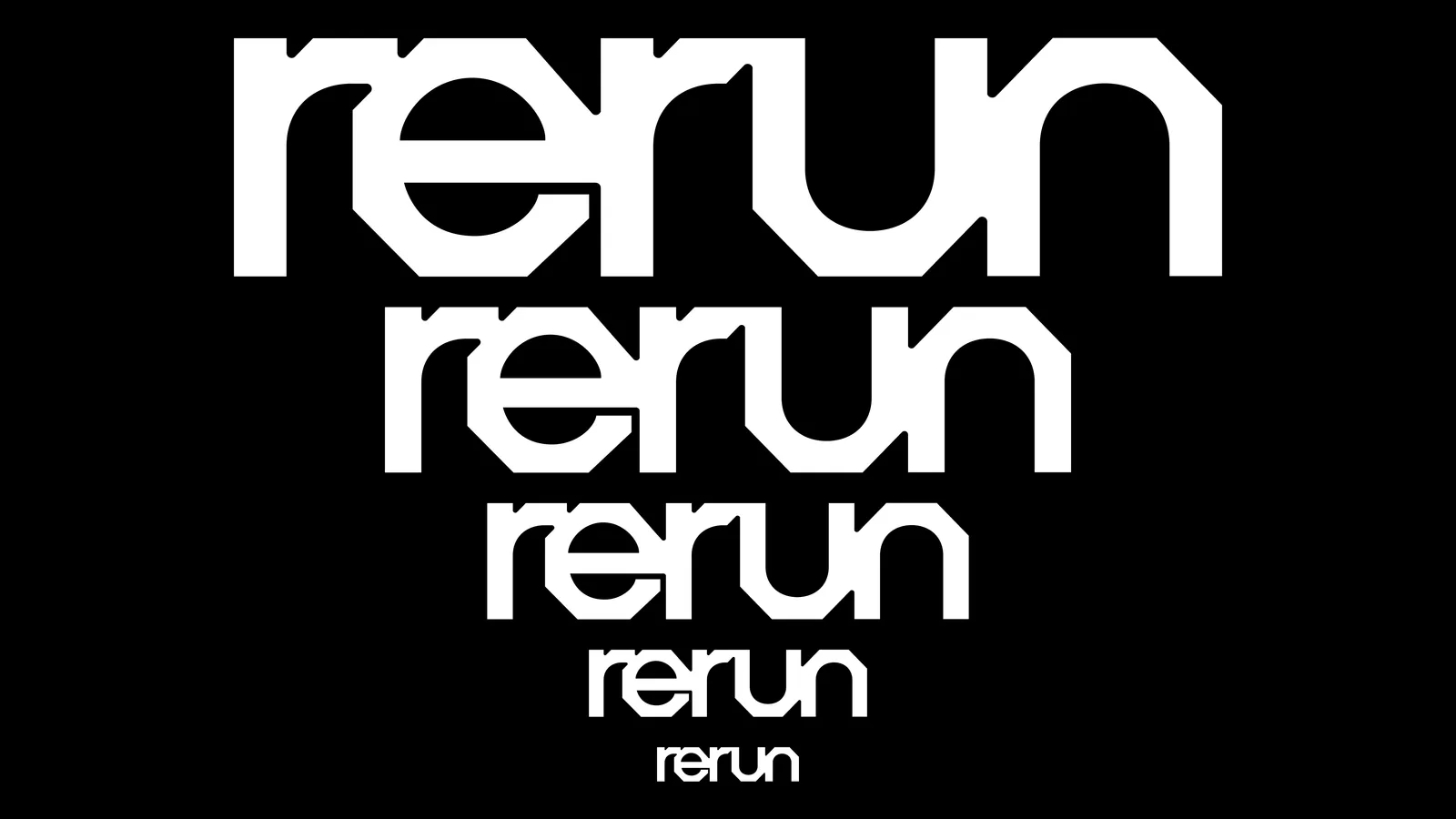
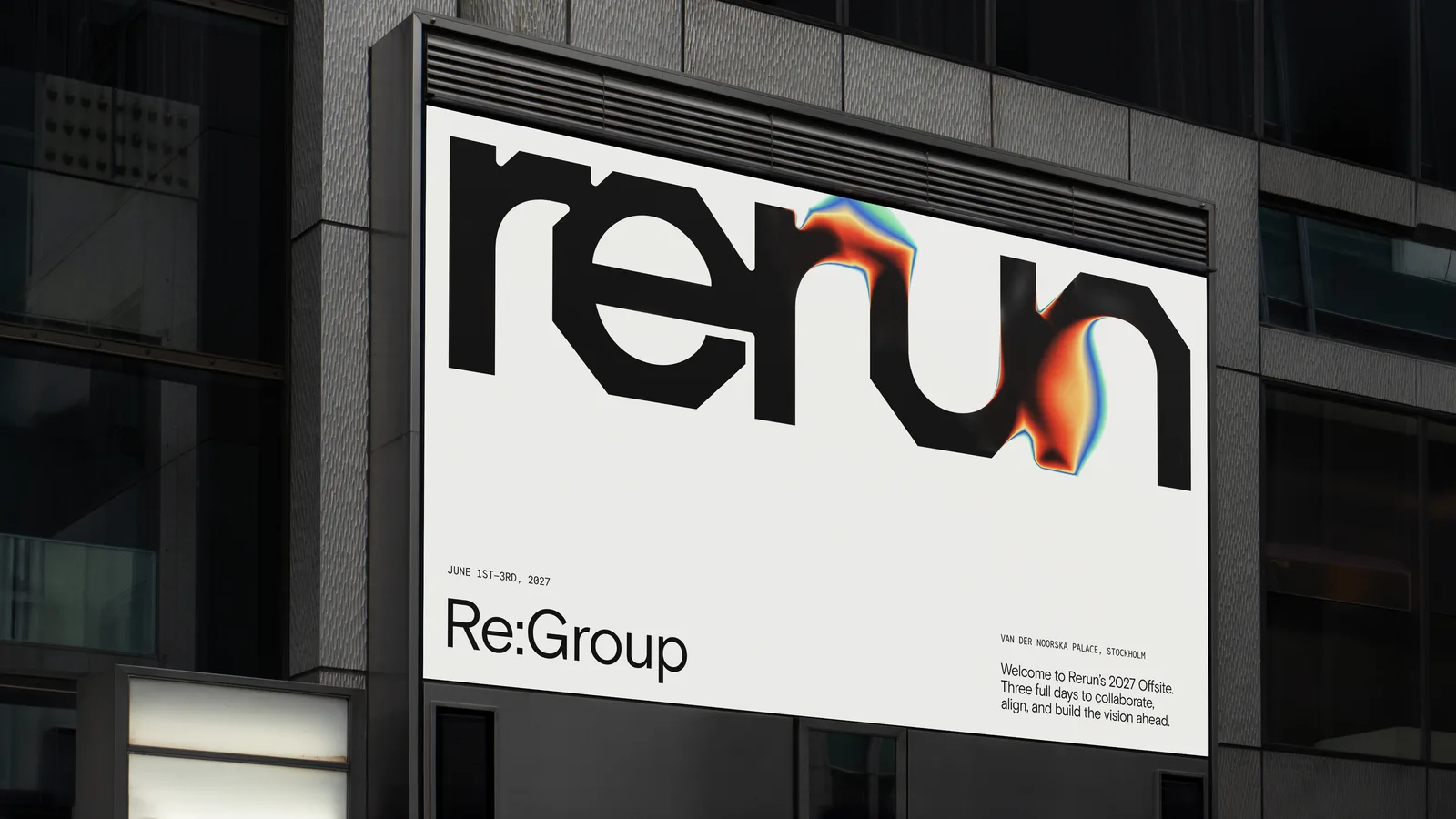
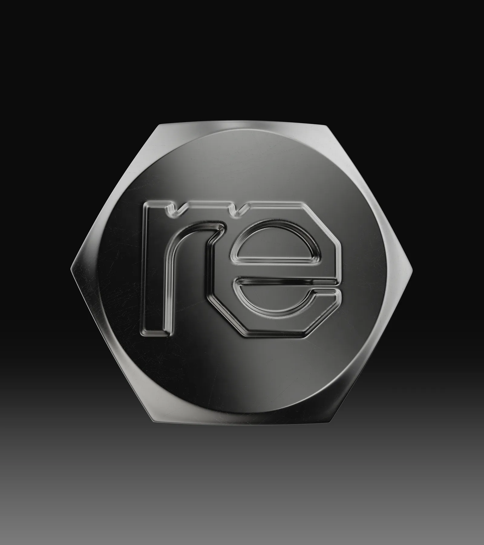
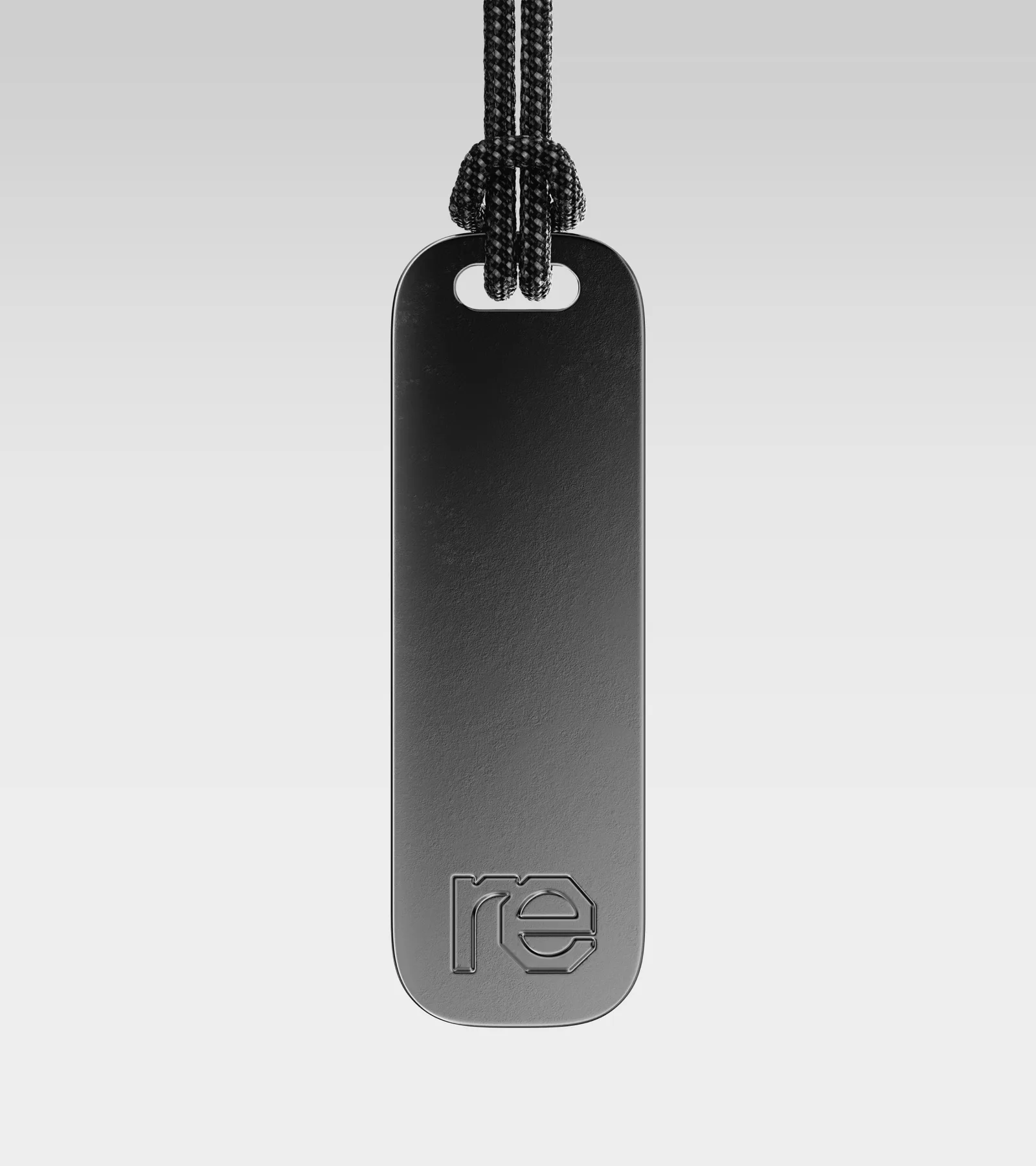
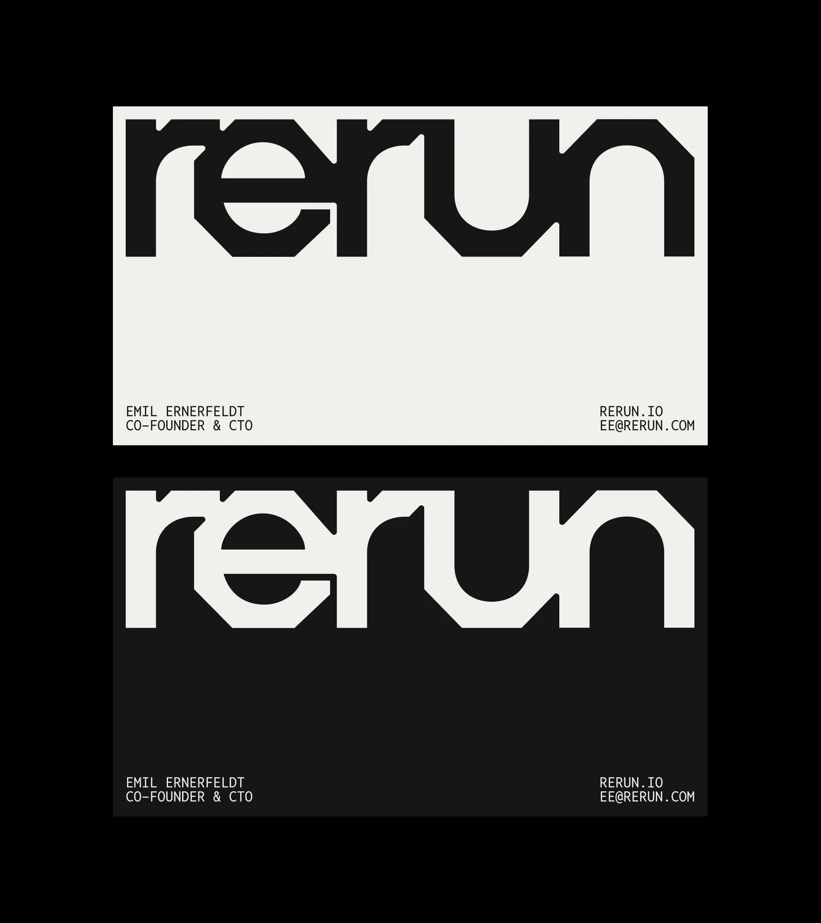
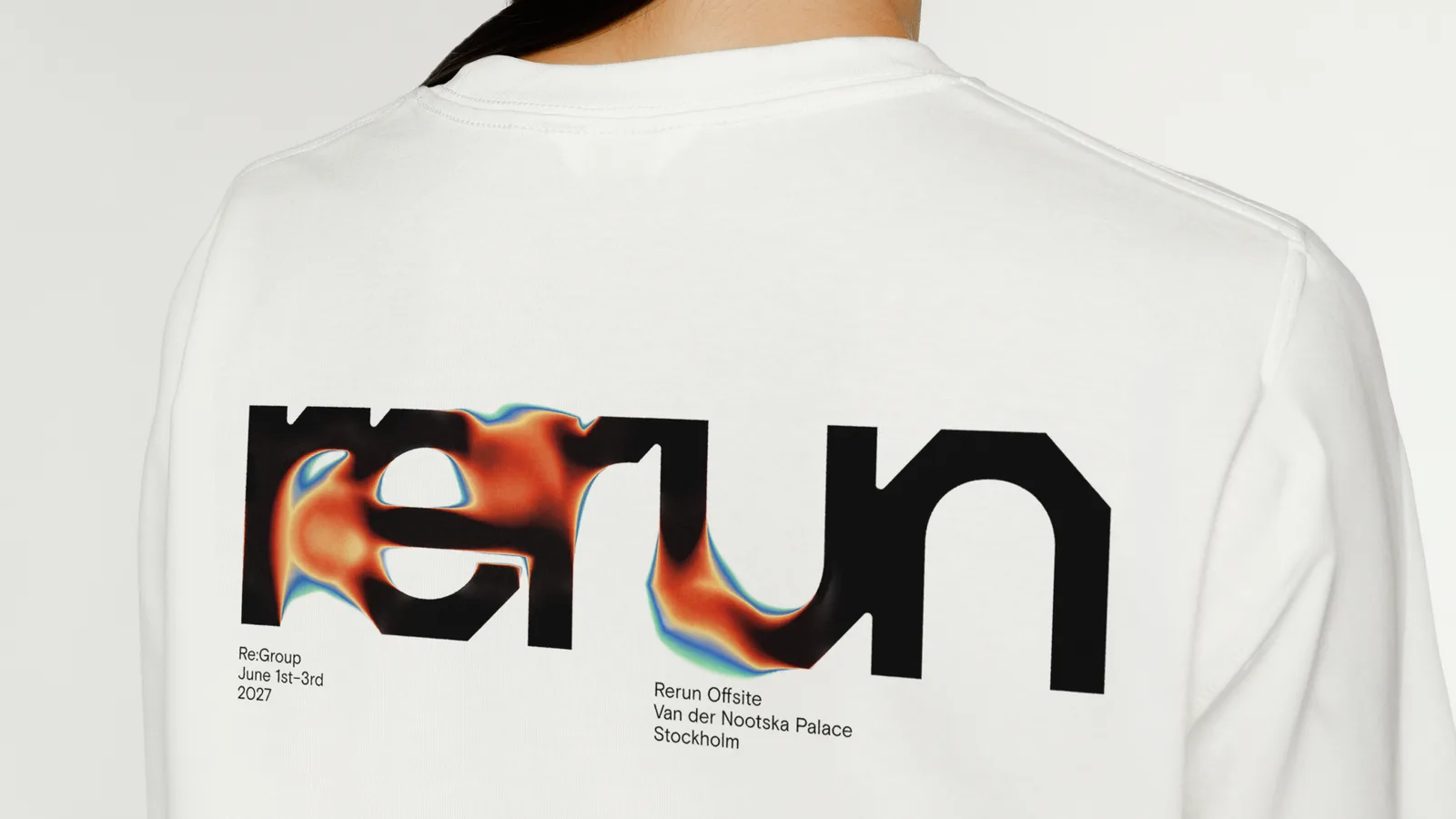
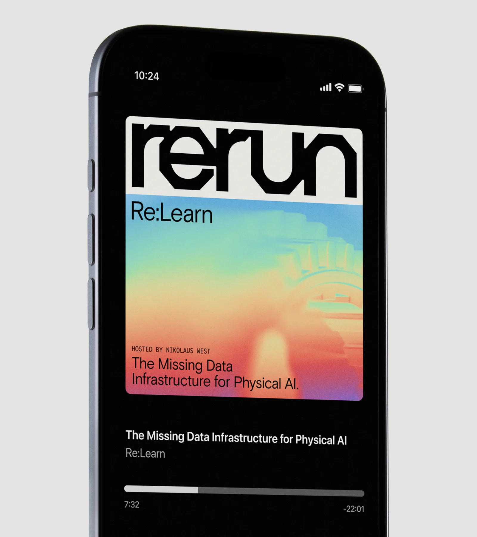
The wordmark takes its shape from the head of a bolt. The lowercase e in the middle is cut into angular facets, and every other letter follows the same geometry. The colours come from Jet and Turbo, the colour maps robots use to turn depth and heat into pictures, so the gradients that run through the artwork are literally a machine's way of seeing, grounded by black, sandpaper grey and white. Basis Grotesque is paired with Reddit Mono on a strict grid.
From there the system grows into a full set of still and moving artworks, logo frames, a website, posters, out of home, stage design, apparel and a design tool of its own. It is rational and clear, but it breaks the look of the category.
Typefaces: Basis Grotesque by Colophon Foundry, Reddit Mono by Reddit
Looking to build an iconic brand identity or packaging?
We partner with ambitious founders, startups, and luxury brands to design distinctive visual identities, bespoke typography, packaging systems, and comprehensive design languages.
Explore Newest & Featured Projects
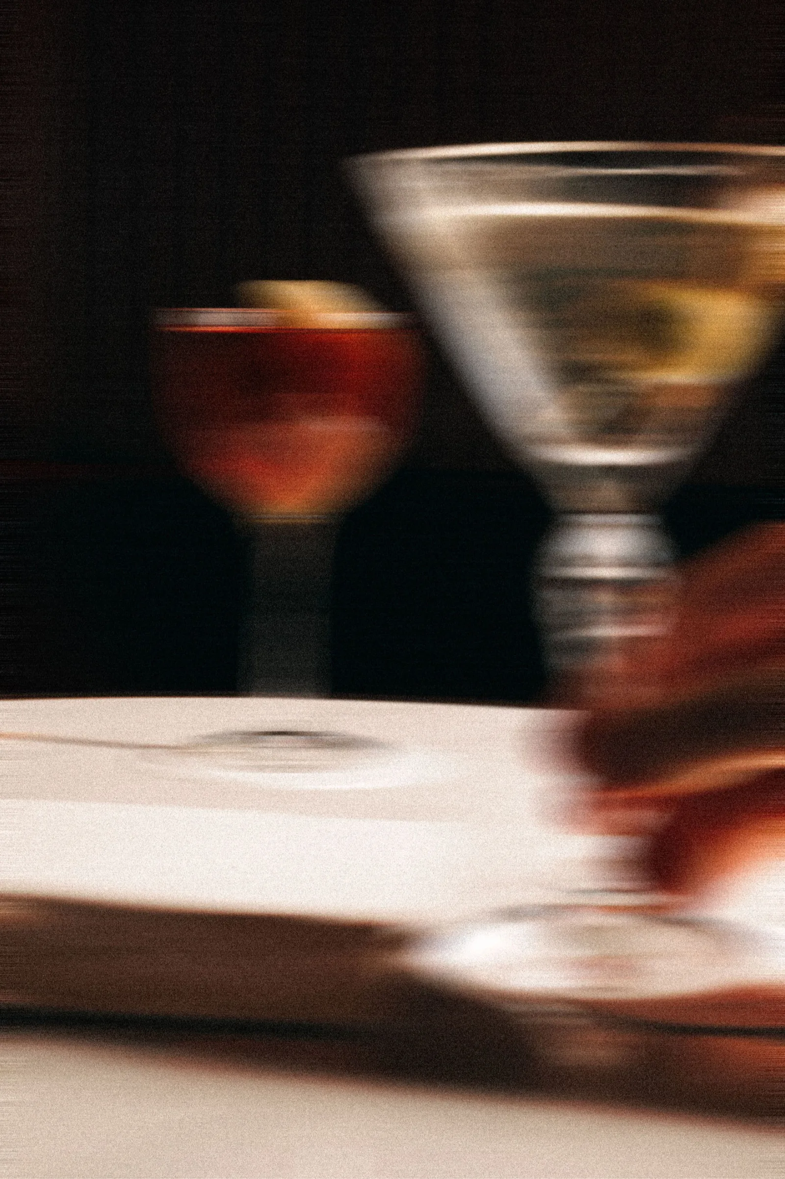 2026 · Branding
Bar Rêve
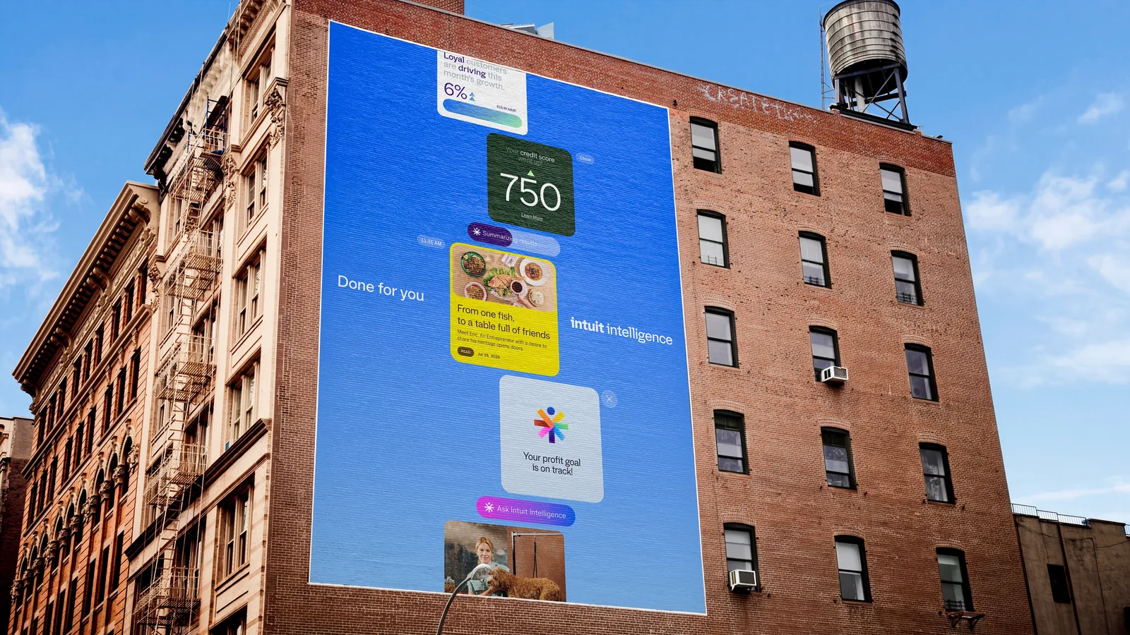 2026 · Branding
Intuit
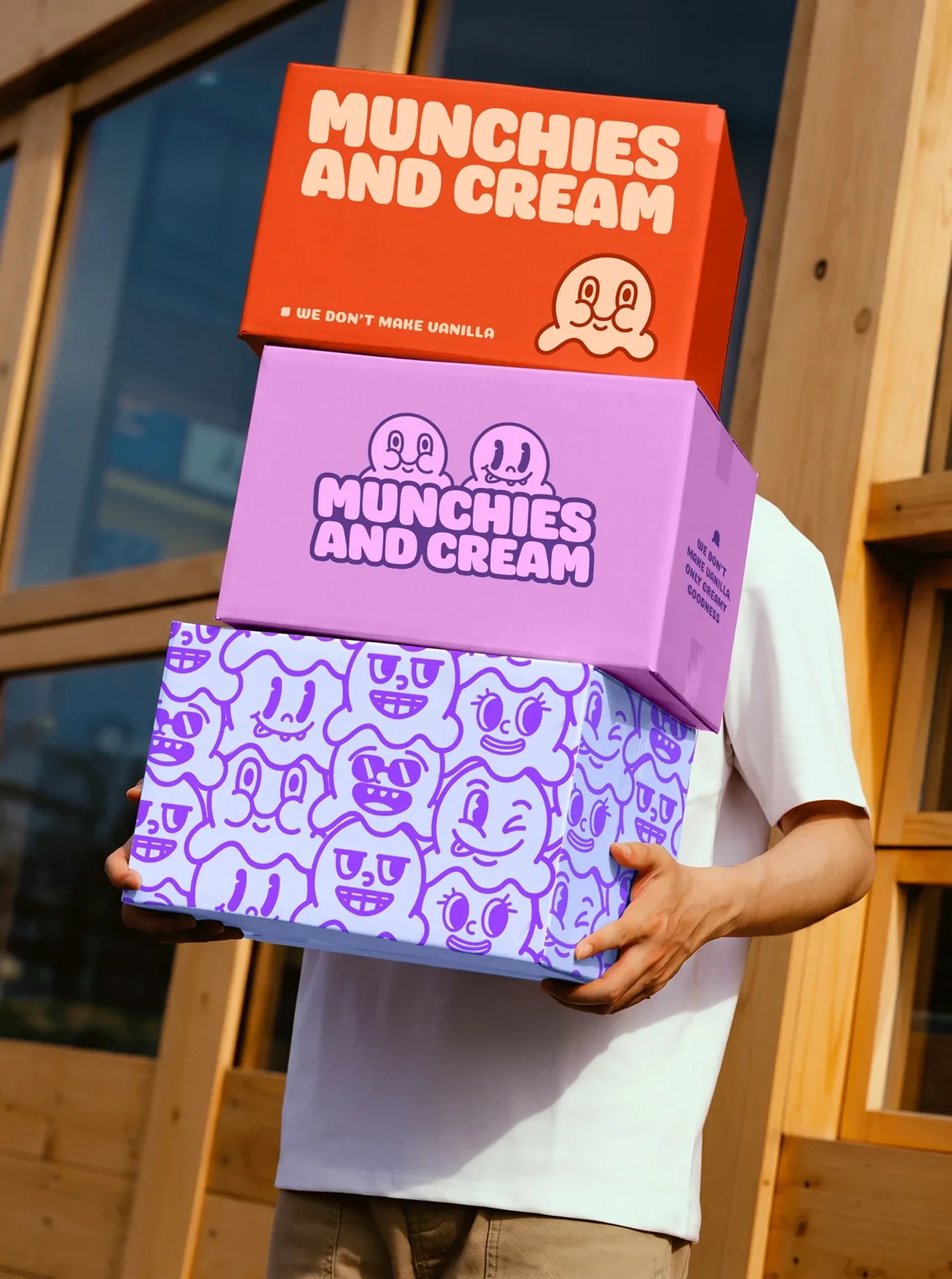 2026 · Branding
Munchies and Cream
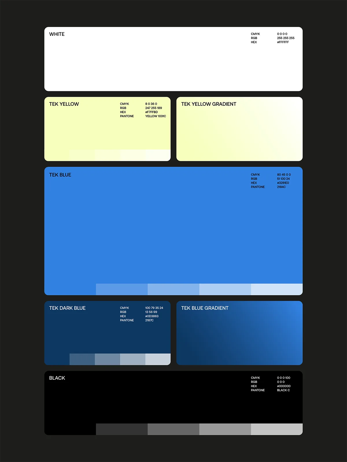 2026 · Branding
Tekprivacy
 2026 · Packaging
Argintum, a Premium Spirit Design where Argentine Mate meets English Gin
 2026 · Packaging
Chrysi represents Extra Fresh Eggs in new Avgoulakia series
 2026 · Packaging
The Tarot Triad: Star, Sun and Moon on Dolcedolka Orange Slices in Chocolate
 2026 · Packaging