Songtrust
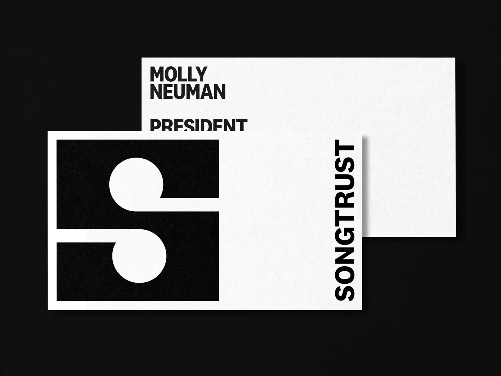
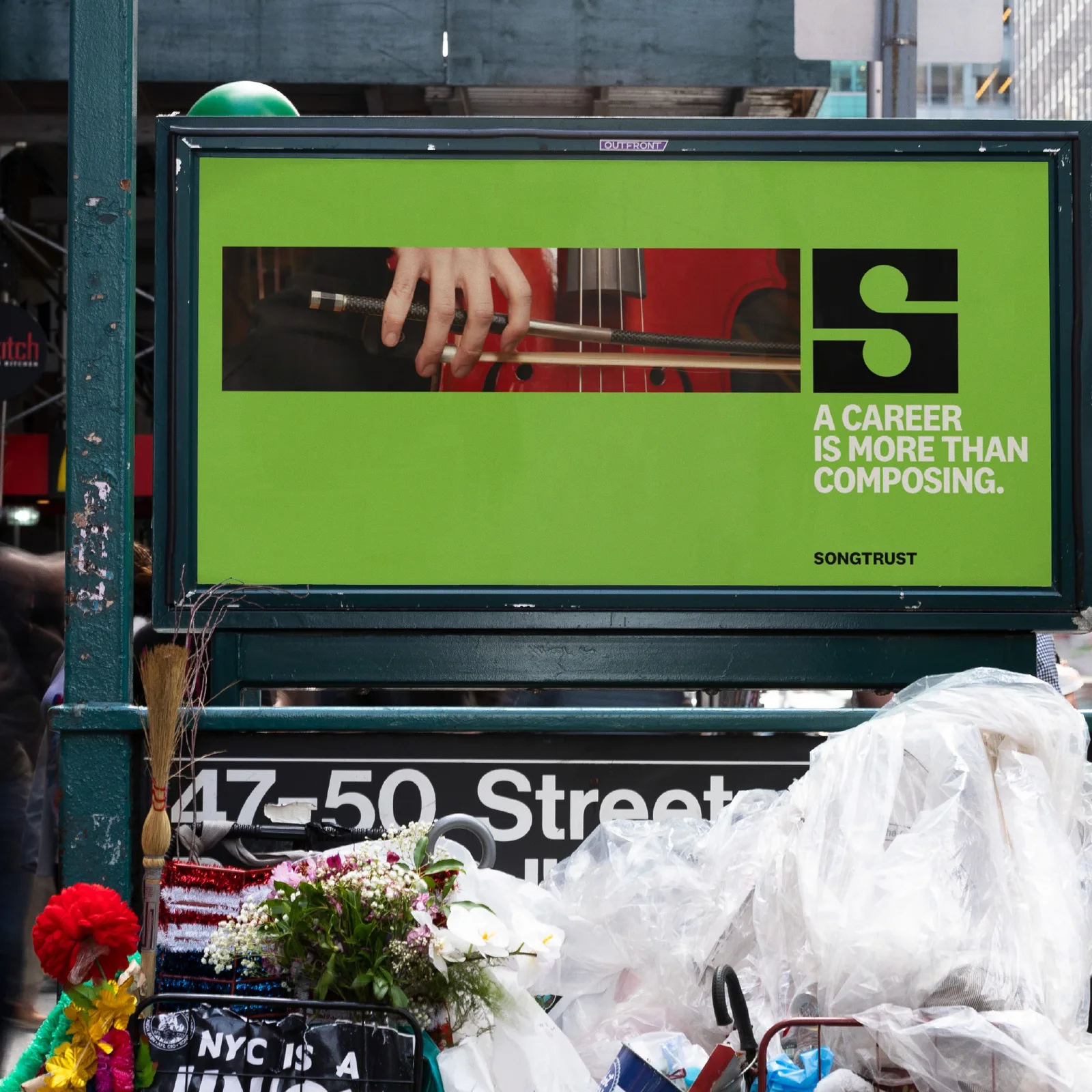
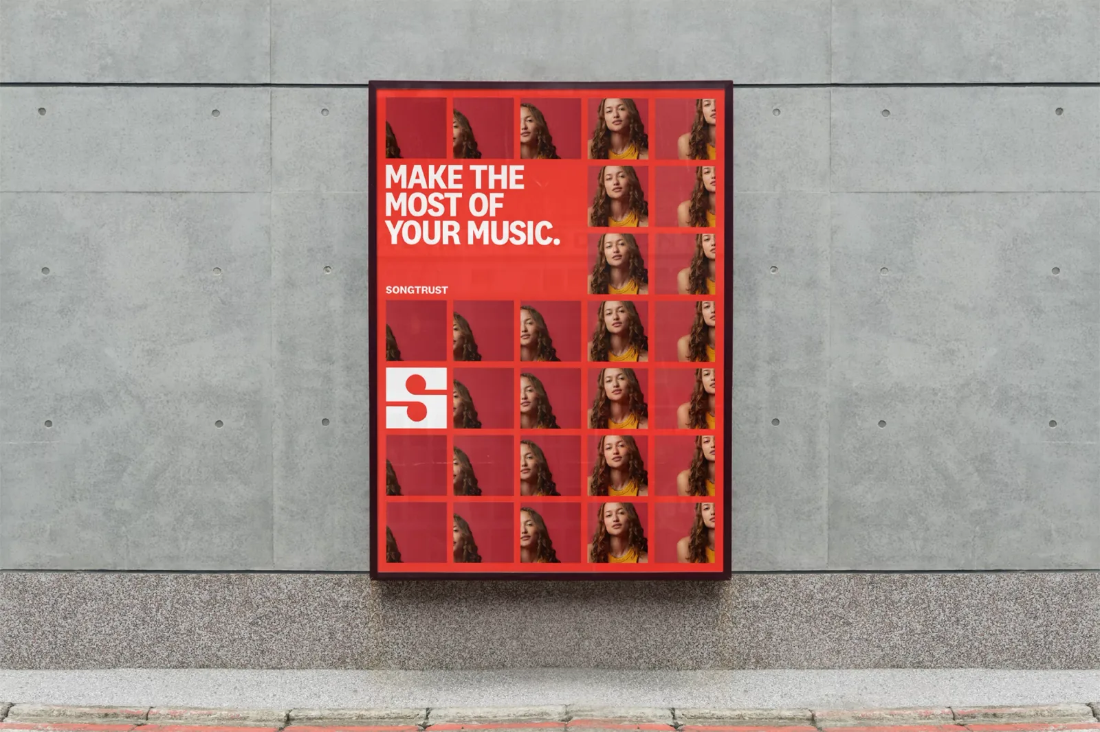
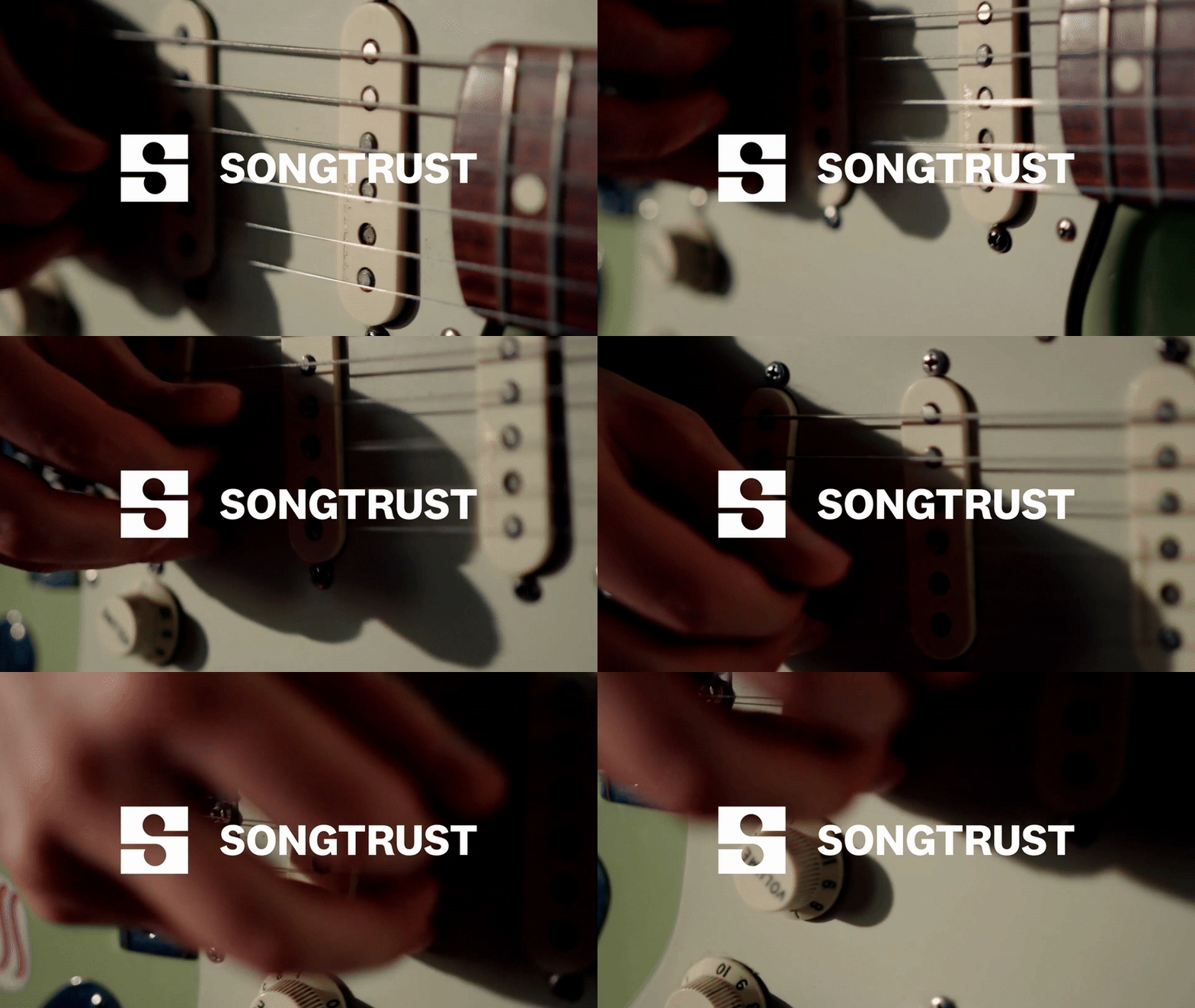
Songtrust, a global music publishing administrator, helps songwriters collect their royalties worldwide. This branding is a prime example of how a good logo can do all the heavy lifting. The strong 'S' monogram, created using music notes in negative space, serves as a timeless and powerful logo for Songtrust.
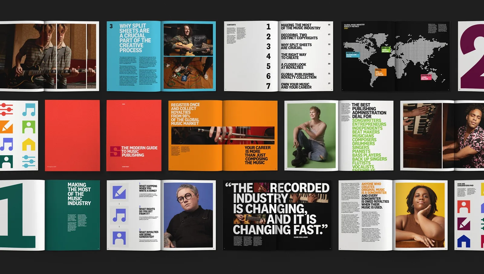
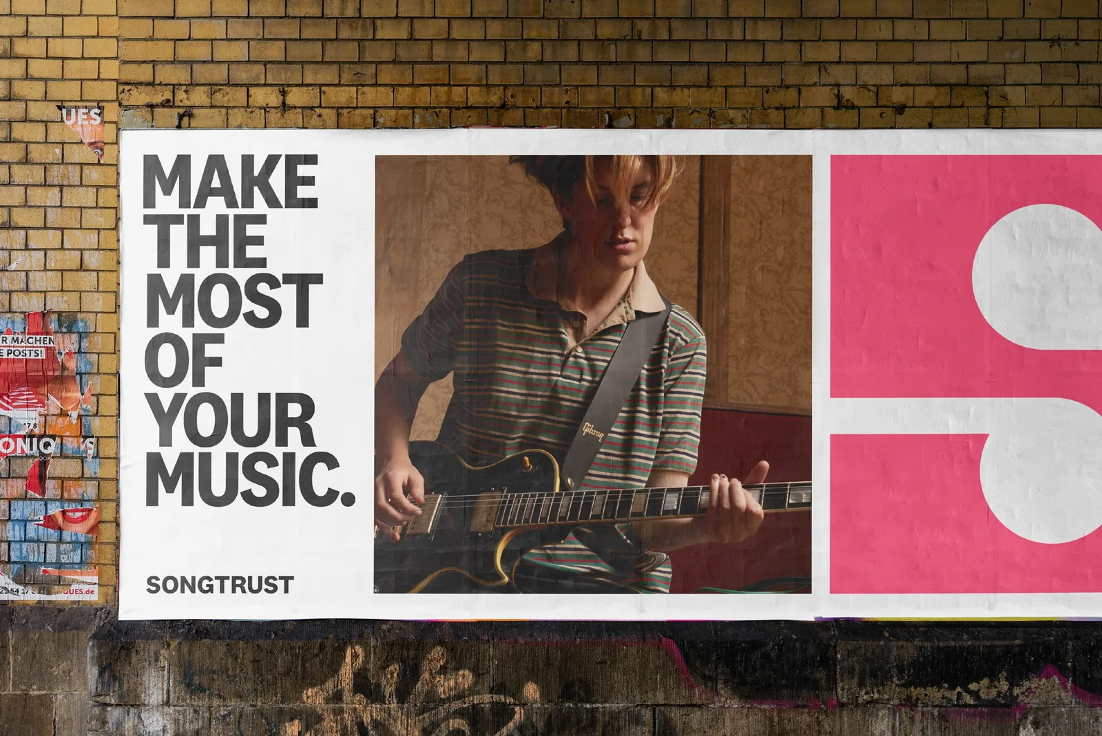
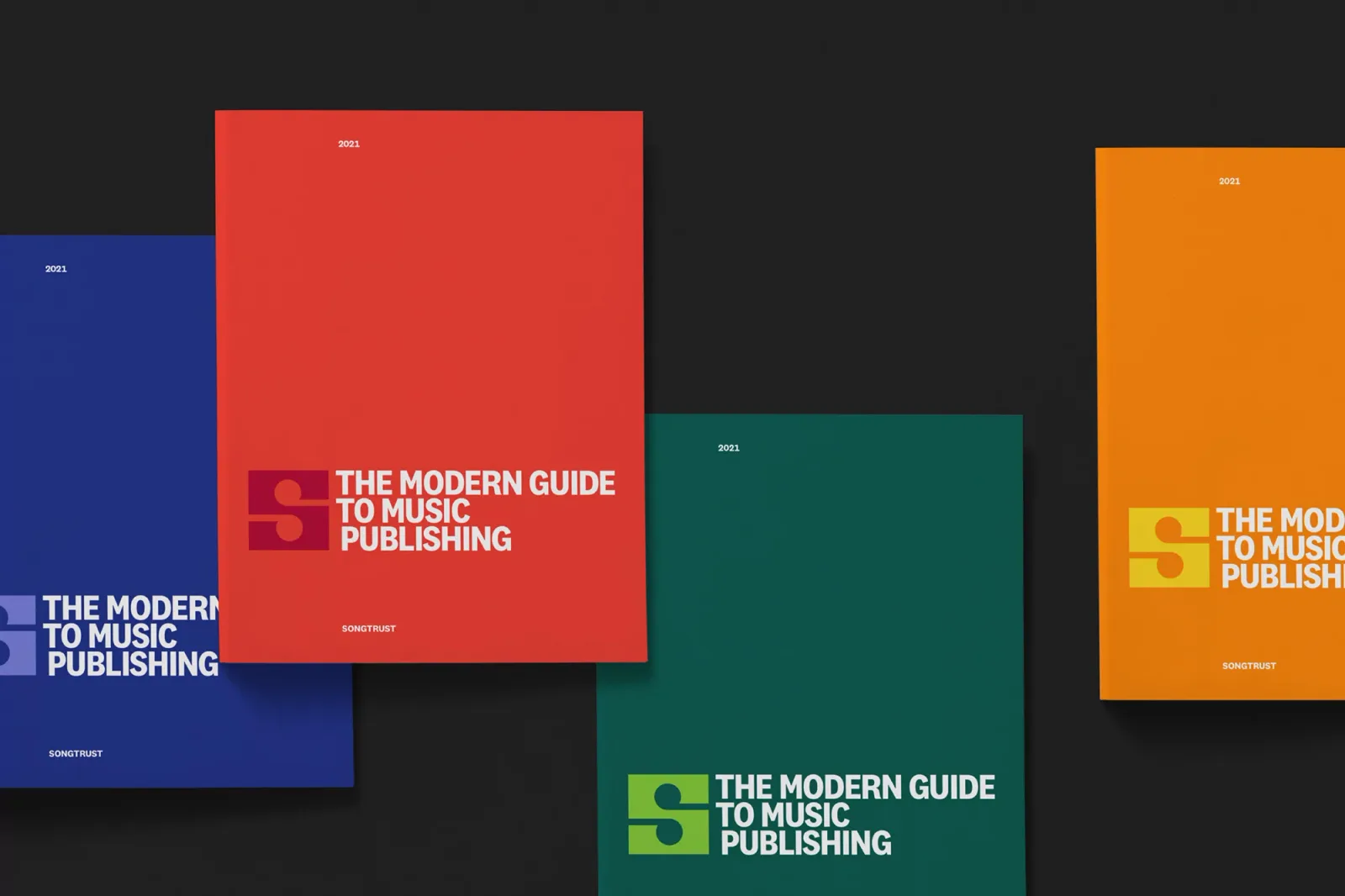
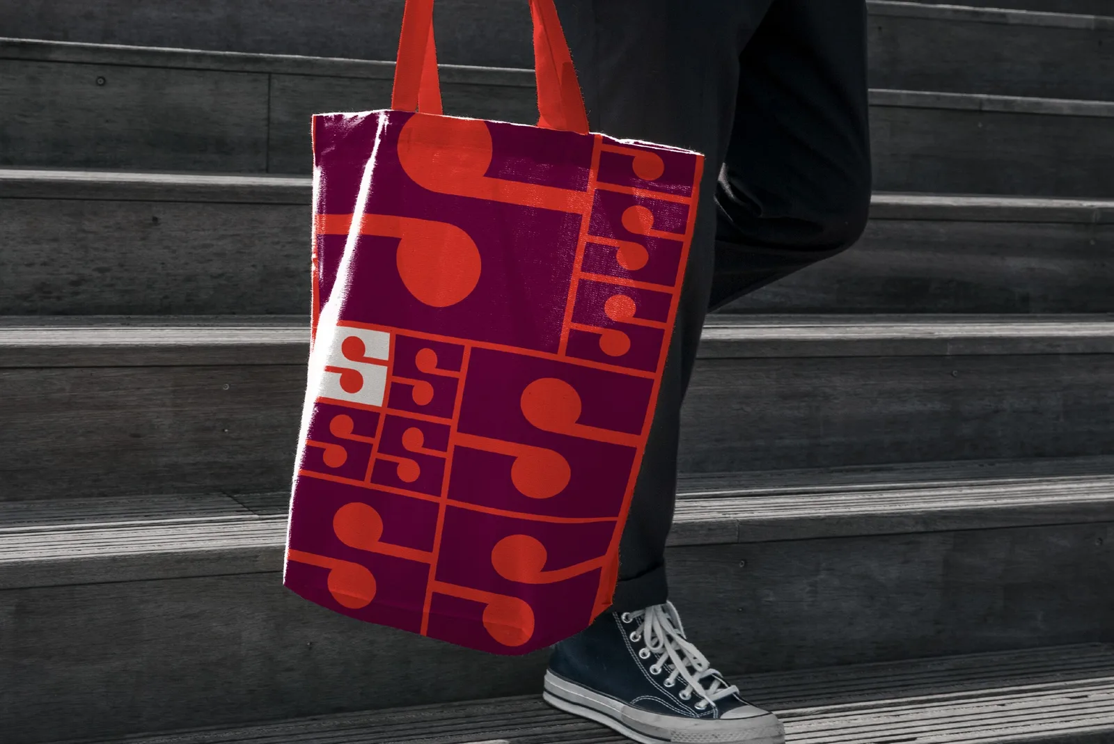
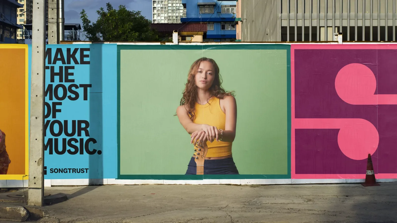
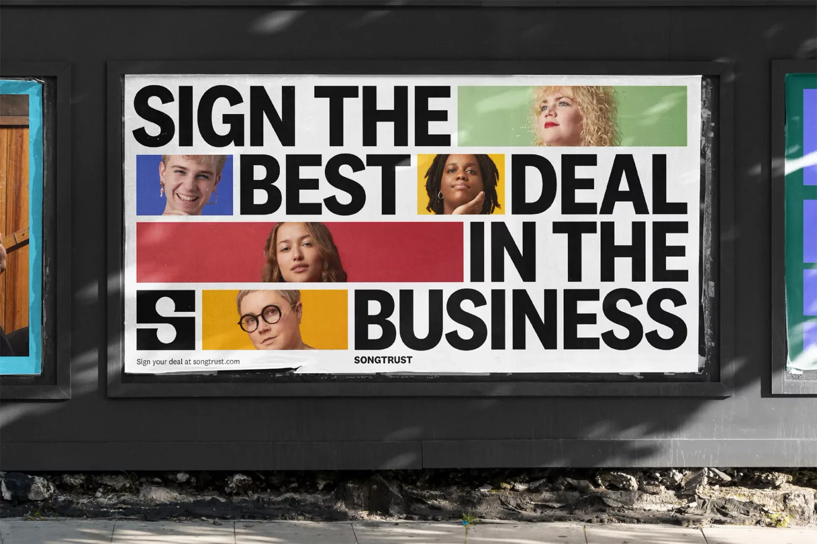
I love how the icon is seamlessly integrated into all branding elements—graphics, posters, bags, business cards, and more. This results in a recognizable and flexible branding, allowing layouts to adapt to various sizes and formats while maintaining consistency.
The colorful branding palette adds vibrancy, striking a perfect balance between playfulness and a more reserved look. For instance, using black and white for business cards provides a corporate feel, whereas colorful posters create a friendly and playful vibe. This approach ensures everything feels cohesive and part of a single brand.
This kind of branding, where a strong logo mark can create an entire visual universe, is truly inspiring.
Looking to build an iconic brand identity or packaging?
We partner with ambitious founders, startups, and luxury brands to design distinctive visual identities, bespoke typography, packaging systems, and comprehensive design languages.
Explore Newest & Featured Projects
 2026 · Branding
Bar Rêve
 2026 · Branding
Intuit
 2026 · Branding
Munchies and Cream
 2026 · Branding
Tekprivacy
 2026 · Packaging
Argintum, a Premium Spirit Design where Argentine Mate meets English Gin
 2026 · Packaging
Chrysi represents Extra Fresh Eggs in new Avgoulakia series
 2026 · Packaging
The Tarot Triad: Star, Sun and Moon on Dolcedolka Orange Slices in Chocolate
 2026 · Packaging