The Bonilat redesign is built around a distinctive heart-shaped visual, symbolizing care, nourishment, and emotional connection. This became the main idea that holds the whole system together. From this central element, the design develops with clarity, softness, and a strong visual rhythm. It is supported by the bold vertical Bonilat wordmark, which immediately draws attention and creates a strong shelf block when the products are placed side by side. The design follows a minimal approach. Gene
View on World Brand Design Society →


Open for Select Client Projects
Looking to build an iconic brand identity or packaging?
We partner with ambitious founders, startups, and luxury brands to design distinctive visual identities, bespoke typography, packaging systems, and comprehensive design languages.
5,800+Brands Curated
<24hResponse Time
100%Bespoke Design
Chat on WhatsApp
Direct Email: mail@usbrandingstudio.com · WhatsApp: +92 317 4002198
Curated Inspiration
Browse All 5,800+ Work →
Explore Newest & Featured Projects
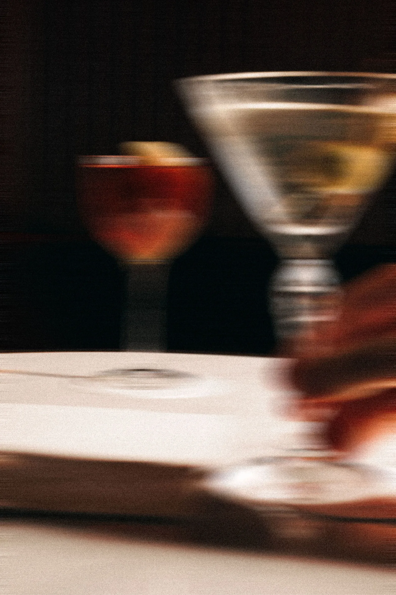 2026 · Branding
Bar Rêve
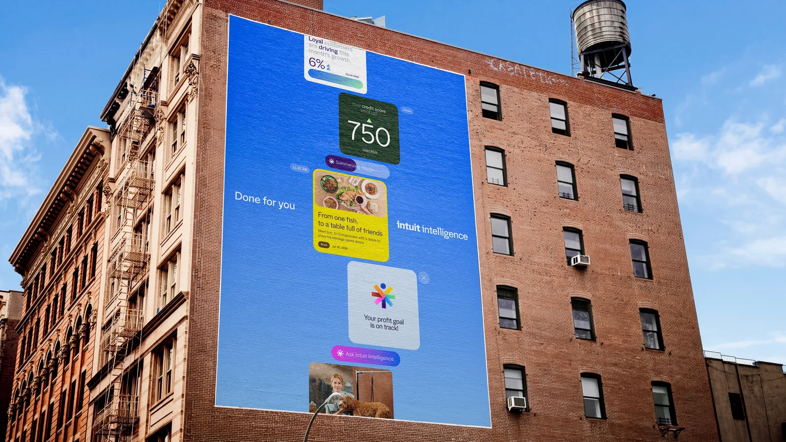 2026 · Branding
Intuit
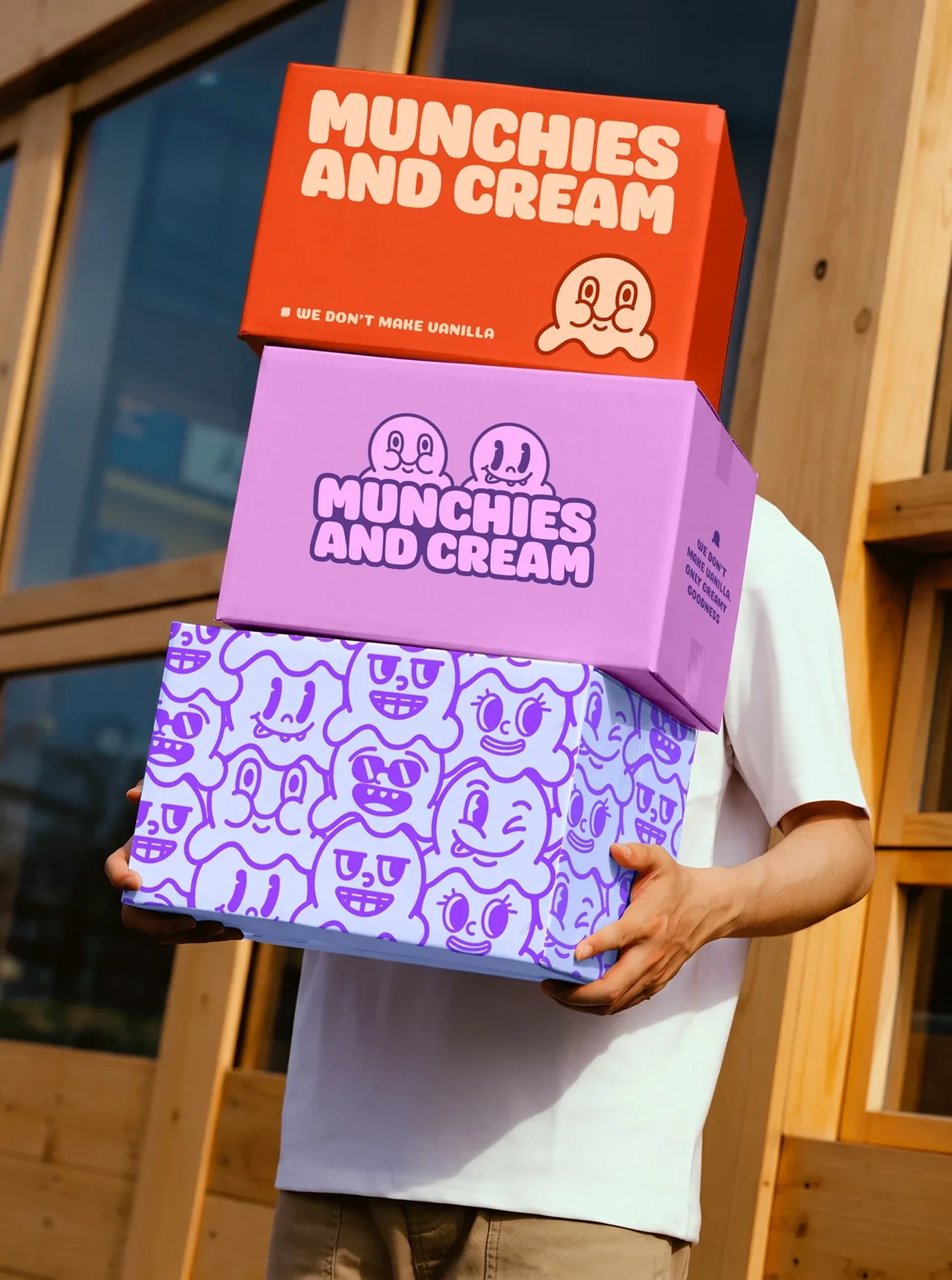 2026 · Branding
Munchies and Cream
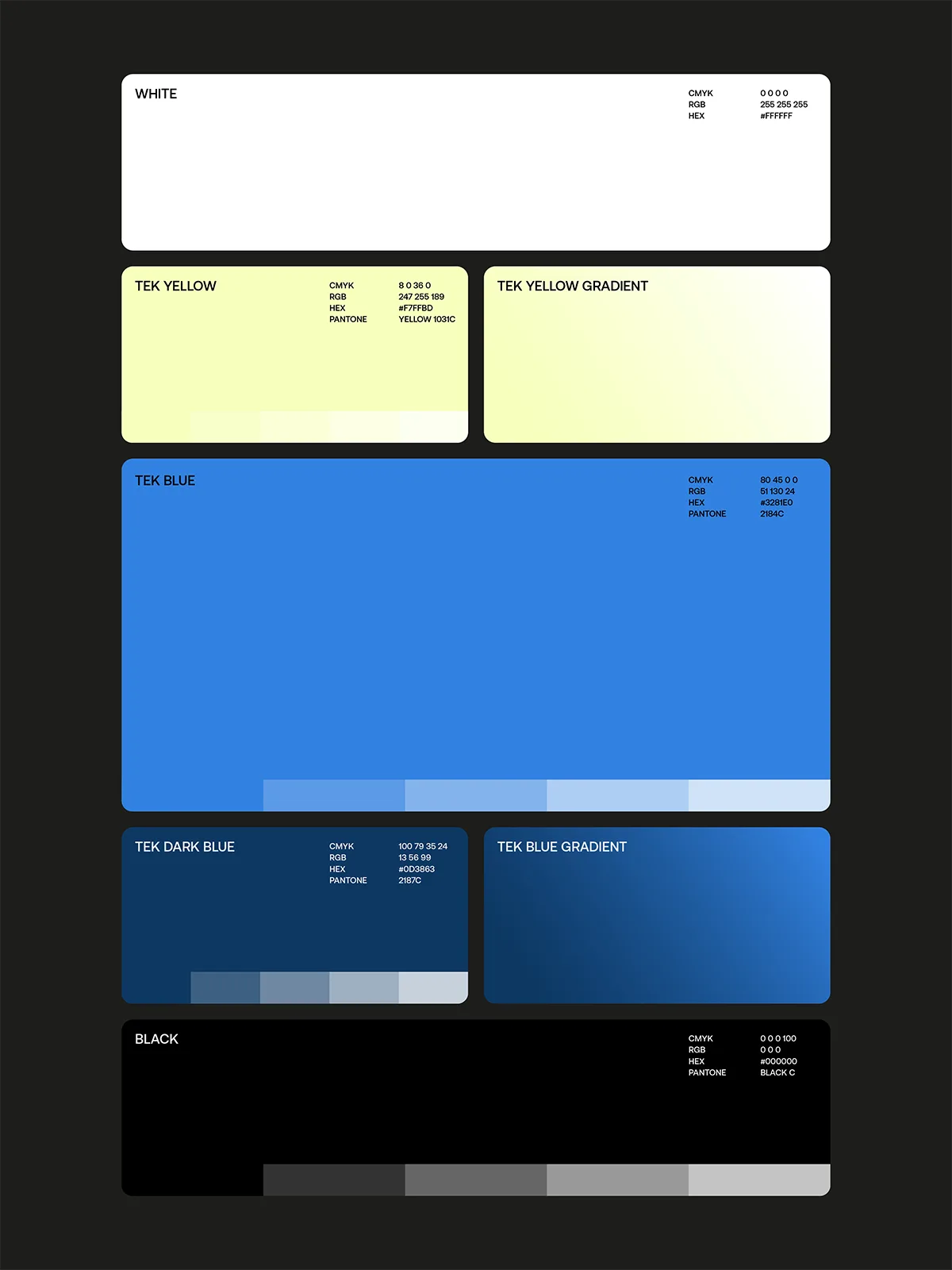 2026 · Branding
Tekprivacy
 2026 · Packaging
Argintum, a Premium Spirit Design where Argentine Mate meets English Gin
 2026 · Packaging
Chrysi represents Extra Fresh Eggs in new Avgoulakia series
 2026 · Packaging
The Tarot Triad: Star, Sun and Moon on Dolcedolka Orange Slices in Chocolate
 2026 · Packaging