The packaging concept for “Saint Anthony” monastery honey is inspired by the halo, one of the key symbols of Saint Anthony’s iconography. The design translates this traditional religious element into a contemporary, minimal visual language. The black label and lid act as a dark background, similar to the panel of an icon, while the figure is reduced to a simple white paper-like silhouette. The arched nameplate becomes both the figure’s shoulders
View Source Project ↗


Open for Select Client Projects
Looking to build an iconic brand identity or packaging?
We partner with ambitious founders, startups, and luxury brands to design distinctive visual identities, bespoke typography, packaging systems, and comprehensive design languages.
5,800+Brands Curated
<24hResponse Time
100%Bespoke Design
Chat on WhatsApp
Direct Email: mail@usbrandingstudio.com · WhatsApp: +92 317 4002198
Curated Inspiration
Browse All 5,800+ Work →
Explore Newest & Featured Projects
 2026 · Branding
Bar Rêve
 2026 · Branding
Intuit
 2026 · Branding
Munchies and Cream
 2026 · Branding
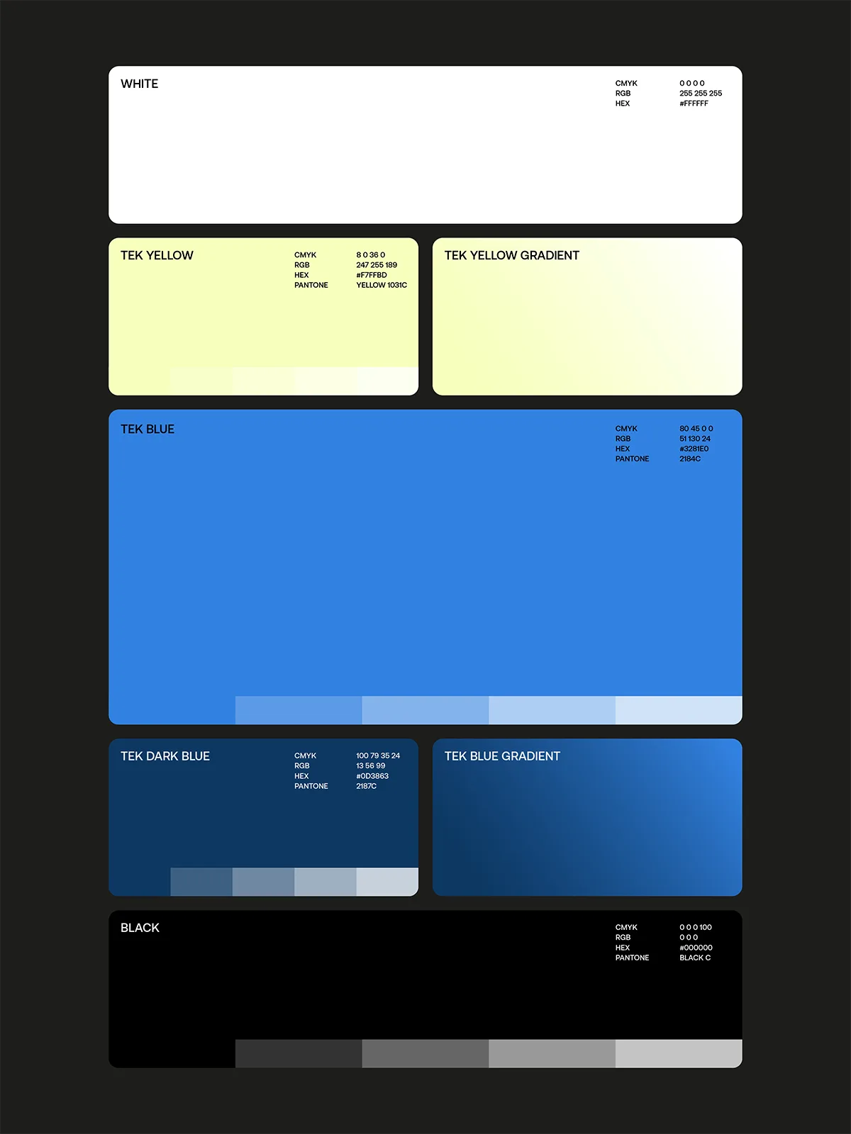
Tekprivacy
 2026 · Packaging
Argintum, a Premium Spirit Design where Argentine Mate meets English Gin
 2026 · Packaging
Chrysi represents Extra Fresh Eggs in new Avgoulakia series
 2026 · Packaging
The Tarot Triad: Star, Sun and Moon on Dolcedolka Orange Slices in Chocolate
 2026 · Packaging